
Introduction to Color Psychology in Home Design
Color is a significant element in interior design, influencing not only the aesthetics of a space but also the emotional well-being of its occupants. Understanding color psychology allows homeowners to make informed decisions about their interior color palette. Each hue carries its own psychological weight, evoking specific emotions that can alter the atmosphere of a room. For instance, warm colors such as reds, oranges, and yellows are known to create a sense of warmth and vitality, often fostering an energetic and inviting ambiance. Conversely, cool colors like blues and greens can impart calmness and serenity, making them ideal choices for bedrooms or relaxation areas.
The impact of color extends beyond individual rooms. In open-concept spaces, selecting a cohesive color scheme can promote harmony throughout the home. Color can guide movement through spaces, drawing attention to particular areas or features. A well-planned palette can create focal points and enhance architectural elements, adding visual interest without overwhelming the senses. Additionally, engaging with color in different ways—through wall paint, furniture, and decorative accessories—can further enrich the living environment.
It is essential to consider personal reactions to color, as individual preferences can vary widely. What may evoke feelings of calm for one person may be distracting to another. Therefore, assessing how colors resonate with members of the household plays a crucial role in the decision-making process. Moreover, incorporating light, material textures, and spatial dimensions alongside color choices can significantly influence the overall experience of the home. By understanding the principles of color psychology, homeowners can effectively utilize color to enhance mood and create spaces that reflect their unique personality and lifestyle.
Factors to Consider When Choosing a Color Palette
When selecting a color palette for your home, several influential elements must be taken into account. One of the most significant factors is your personal style. Your home should reflect who you are, so consider colors that resonate with your tastes and preferences. Whether you prefer bold and vibrant shades, soft pastels, or neutral tones, it’s essential to choose a color scheme that makes you feel comfortable and happy in your space. Look for inspiration in art, nature, or even your wardrobe, as these can guide your color selection.
The size of the space you are working with also plays a crucial role in determining an appropriate color palette. Lighter colors tend to create a sense of openness and can make smaller rooms appear larger, while darker hues can add warmth and coziness to expansive areas. When deciding on your colors, consider how they will interact with the dimensions of the room. It may be beneficial to use a combination of colors that help to visually define and enhance the space.
Lighting is another critical aspect to consider. The amount of natural light a room receives can dramatically alter how colors are perceived. For instance, a hue that appears bright and vibrant in daylight might look duller under artificial lighting. Assess the available light in your spaces at different times of the day to understand how it affects your chosen colors. Additionally, it is vital to evaluate your existing furniture and decor items. Colors that harmonize with your current furnishings will create a cohesive and visually appealing environment. By carefully considering these factors, you can craft a color palette that not only complements your home’s architecture but also enhances your overall lifestyle.
Popular Color Schemes for 2023
As homeowners seek to refresh their spaces, understanding the trending color schemes of 2023 can guide them in choosing the perfect palette. This year, various color combinations that bring harmony and aesthetics are capturing attention, making them ideal for different areas of the home.
One of the dominant trends is the monochromatic palette. This scheme involves utilizing different shades and tints of a single color. It’s an excellent choice for creating a serene and cohesive look, particularly in bedrooms and living spaces. For instance, varying shades of blue can evoke calmness and promote relaxation. By incorporating different textures and materials, homeowners can add depth and interest while avoiding a flat appearance.
In addition to monochromatic schemes, analogous color palettes are gaining popularity. This approach involves selecting colors that are adjacent on the color wheel. For example, a combination of green, blue, and teal can create a refreshing and harmonious environment, perfect for kitchens or home offices. The subtle transition between colors fosters a sense of balance and can make spaces feel more inviting and cohesive.
Complementary color schemes also make a strong statement in 2023. This strategy entails pairing colors that are opposite each other on the color wheel. For example, the combination of orange and blue or red and green can create a vibrant, energetic atmosphere. Such schemes are particularly effective for accent walls or smaller spaces, drawing attention and creating focal points without overwhelming the area.
As we explore these trending color combinations, it’s important to consider how they resonate with our personal styles and the ambiance we wish to cultivate in our homes. Adopting these popular color schemes can undoubtedly enhance the visual appeal and emotional impact of living spaces.
Warm vs. Cool Colors: How to Decide
When selecting a color palette for your home, understanding the distinction between warm and cool colors can significantly influence the overall ambiance of your space. Warm colors, such as reds, oranges, and yellows, often evoke feelings of comfort and coziness. These hues tend to create an inviting atmosphere, making them suitable for areas where you want to encourage social interaction, such as living rooms and dining areas. By incorporating warm tones, homeowners can enhance a sense of warmth and intimacy, which is particularly advantageous in colder climates.
Conversely, cool colors like blues, greens, and purples exude calmness and tranquility. These shades are typically associated with feelings of peace and relaxation, making them ideal for spaces intended for rest, such as bedrooms and bathrooms. Cool colors can also create an illusion of spaciousness, which is useful in smaller rooms where a more expansive feel is desired. When choosing a color palette, the perception of space is crucial; cool colors tend to recede, while warm colors can bring surfaces closer, thus altering the visual dynamics of a room.
It is essential to reflect on the specific mood you wish to cultivate in each area of your home. Factors such as lighting, room size, and existing furnishings will influence how colors are perceived. For instance, a small room painted in a deep warm color may feel cramped, while the same room in a light cool shade may appear larger and more open. Conversely, using a warm accent color in a predominantly cool room can create visual interest and add vitality. Ultimately, balancing warm and cool colors can provide a harmonious and inviting atmosphere that resonates with personal preferences while enhancing the functionality of the space.
Choosing a Color Palette for Different Rooms
When selecting a color palette for your home, it is essential to tailor your choices to the unique characteristics and uses of each room. Different spaces evoke varied moods and serve specific functions, making color selection a critical element in interior design.
Starting with the living room, a space often designated for relaxation and social interaction, consider warm neutral tones like beige, taupe, or soft grays. These colors foster a welcoming atmosphere and can be paired with more vibrant accents like deep blues or rich greens to stimulate conversation while maintaining a sense of comfort.
For bedrooms, the focus should be on tranquil and calming colors. Shades such as soft pastels, light blues, or muted purples can create a restful environment conducive to sleep. Complementing these colors with white or cream trim can enhance the serene ambiance. Consider using slightly darker tones for accent walls to add depth while keeping the room feeling cozy.
In kitchens, which serve as both functional and social gathering spaces, brighter and fresher colors can invigorate the atmosphere. Soft yellows, crisp whites, and light greens can reflect cleanliness and promote a cheerful vibe. Additionally, incorporating vibrant accent colors through accessories or small appliances can make the kitchen feel lively yet cohesive.
Bathrooms, being spaces for relaxation and rejuvenation, benefit from a color palette that elicits a spa-like feel. Shades of soft blues, calming greens, or classic whites are popular choices, creating a refreshing and airy environment. Adding hints of warmer tones through towels or decorative items can provide balance and comfort.
Overall, choosing a color palette tailored to the specific purpose and aesthetic goals of each room ensures that your home conveys the desired atmosphere and functionality, enhancing your overall living experience.
The Role of Accent Colors in Home Design
Accent colors play a crucial role in home design, offering a means to inject personality and flair into a living space without overwhelming it. By strategically incorporating bolder colors in smaller doses, you can create visual interest and focal points that elevate the overall aesthetic. This approach ensures that while the primary palette sets a harmonious backdrop, accent colors provide depth and contrast, enhancing the home’s overall appeal.
When selecting accent colors, it is essential to consider the existing color scheme. Look for colors that either complement or contrast with the primary hues, ensuring a balanced integration. For instance, if the main palette consists of muted neutrals, a vibrant accent color such as deep teal or warm mustard can bring life into the room. Utilize these striking shades in various forms, such as throw pillows, artwork, or decorative objects, to avoid overpowering the space and to create a cohesive design.
Moreover, think about the emotional impact of colors when choosing your accents. Colors have different psychological effects; for example, bold reds and oranges are energizing, while blues and greens tend to evoke calmness. Consider the purpose of the room when selecting the accent colors. In high-traffic areas, like the living room, you may opt for a lively accent to foster interaction, while a serene hue may be better suited for bedrooms and relaxation spaces.
To achieve a well-balanced interplay between accent colors and the primary palette, follow the 60-30-10 rule: allocate 60% of the room to a dominant color, 30% to a secondary color, and 10% to accents. This rule serves as a guideline to ensure that the accent colors stand out without feeling forced. By thoughtfully incorporating accent colors, you can achieve a sophisticated design that reflects your personal style while maintaining harmony throughout your home.
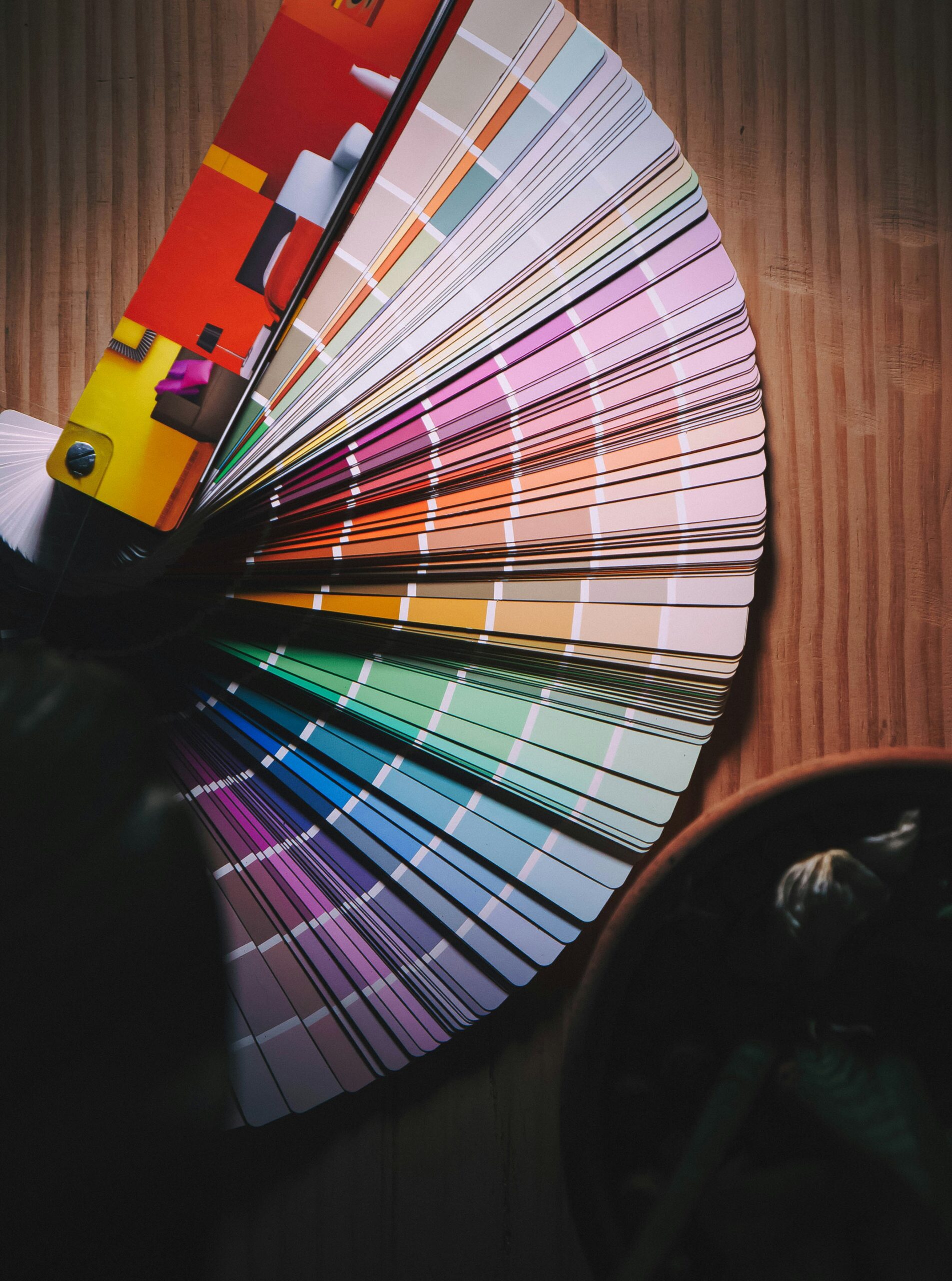
Testing Colors Before Committing
Choosing the right color palette for your home is a crucial step in the decorating process. Selecting a color can be a daunting task, and making hasty decisions can lead to dissatisfaction later on. Therefore, it is essential to test colors before making any final commitments. One effective technique for testing is the use of paint swatches. Applying small samples of paint on the wall allows you to visualize how the color interacts with your space.
When testing colors, it is important to consider the lighting conditions in your home. Colors can appear significantly different under various lighting scenarios. To ensure you are making the best choice, observe paint samples at different times of the day, from morning light to evening shadows. This practice will help you see how natural light influences the tone and mood of each color, revealing undertones you may not notice at first glance.
Additionally, consider the surroundings where the paint will be applied. Testing colors alongside furniture, flooring, and other decor can create a better understanding of how the color will harmonize with your existing design elements. Pay attention to how the hue complements or contrasts with other features in the room. It might be helpful to create a mood board that showcases the potential colors alongside textures and patterns to visualize the overall effect.
Ultimately, taking your time with testing colors will lead to a far more satisfying result. Avoiding the pressure of immediate decisions and allowing yourself to experiment with different hues ensures that your chosen color palette will align beautifully with your vision for your home. A well-considered approach will help you create a space that you will love for years to come.
Maintenance of Color Palettes: Touch-up and Refresh Tips
Maintaining the vibrancy and integrity of your home’s color palette is crucial in ensuring that your living environment continues to reflect your design aesthetic over time. One of the primary considerations in maintaining painted surfaces is timely touch-ups. Over the years, walls and accents may experience wear and tear, resulting in scuffs, scratches, or fading. Keeping a small supply of the original paint on hand will be beneficial for such touch-ups. When possible, ensure the paint is stored in a cool, dry area to preserve its quality.
When performing touch-ups, it is vital to approach the task with precision. Start by cleaning the area to be repaired, using a gentle soap solution to remove dust or grease. If the area is especially damaged, lightly sand the surface before applying the new paint. Use a high-quality brush for better control and a finish that blends seamlessly with the surrounding area. For best results, paint in the direction of the original strokes. This technique will help in achieving a uniform appearance across the surface.
Additionally, regular cleaning of painted surfaces can significantly enhance the durability and appearance of your color palette. Utilizing a soft microfiber cloth and a mild detergent solution can keep walls looking fresh without damaging the paint. Be sure to test any cleaning agent on a small, inconspicuous area before full application to prevent any adverse effects.
Updating your color palette periodically is another strategy to revitalize your home’s aesthetic without undertaking a complete repaint. Consider introducing new accent colors through accessories such as cushions, rugs, or artwork. This approach not only refreshes the space but also allows flexibility in style and décor. By incorporating these maintenance tips, you can keep your home’s color palette fresh and inviting for years to come.
Conclusion: Finding Your Unique Style with Color
Choosing the perfect color palette for your home is a personal journey that plays a crucial role in defining your living space. Throughout this blog post, we have explored various strategies for selecting colors that resonate with your unique style and preferences. Understanding the psychology behind colors, the importance of lighting, and the impact of furniture and decor can significantly enhance your home’s aesthetic. These elements work harmoniously to create an inviting atmosphere that not only reflects your personality but also fosters a sense of well-being.
When embarking on this colorful endeavor, it is essential to consider how each hue interacts with one another. Experimenting with combinations of complementary colors can lead to a more dynamic and visually appealing environment. Additionally, the use of neutrals can provide balance, allowing bolder shades to shine without overwhelming the senses. Remember, the ultimate goal is to establish a harmonious space that you and your loved ones can truly enjoy.
Moreover, don’t shy away from exploring your creativity. Incorporating personal touches and unique color combinations can make your home distinctly yours. Whether you prefer a serene palette of soft blues and greens or a vibrant mix of oranges and yellows, your color choices should evoke joy and comfort. Consider experimenting with accent walls or decorative items that highlight your chosen colors, as these can significantly contribute to the overall ambiance.
In conclusion, your home is a reflection of who you are, and your color palette should faithfully represent your individuality. Embrace the process of discovering what resonates with you, and have confidence in your choices. By selecting the right colors, you can transform your living space into a harmonious and joyful sanctuary that you will cherish for years to come.